How to Create Perfect WordPress Menus & Widgets
Perfect WordPress Menus & Widgets Guide (Beginner to Pro)
Navigation can make or break a WordPress website. A beautiful homepage and strong content will not save a site that is confusing to navigate. Clear menus and smart widgets guide visitors effortlessly to the pages that matter, keep them on your site longer, and send powerful positive signals to search engines.
This guide will take you from “I just installed a theme” to “My menus and sidebars look like a professional agency built them”. You will learn the exact steps to design clean, logical menus and high‑converting widget areas in WordPress.
1. Understanding Menus vs. Widgets in WordPress
Menus control your site’s navigation structure: the links you see in the header, footer, or sometimes in mobile side drawers. They organize your key pages, categories, and custom links into a clear hierarchy.
Widgets are small functional blocks that live in widget areas such as sidebars, footers, or sometimes below posts. They can display search boxes, latest posts, social icons, contact info, or custom HTML.
Together, menus and widgets form the skeleton of your user experience: menus move users through the site; widgets keep them engaged, informed, and moving deeper into your content.
2. Planning a High‑Converting Menu Structure
Before touching the dashboard, sketch the structure of your main menu. A messy navigation bar with ten random items is one of the fastest ways to lose visitors.
For most sites, a winning primary menu includes:
-
Home
-
About / Our Story
-
Services or Courses (with dropdown sub‑items)
-
Blog or Resources
-
Contact
If your site is content heavy, add key categories under “Blog” as dropdown items, so users can jump straight to topics that matter. For ecommerce, use top‑level menus like “Shop”, “Collections”, and “Offers”, then group products under logical sub‑menus.
Keep the top level between five and seven items; anything more feels overwhelming and harms both UX and SEO.
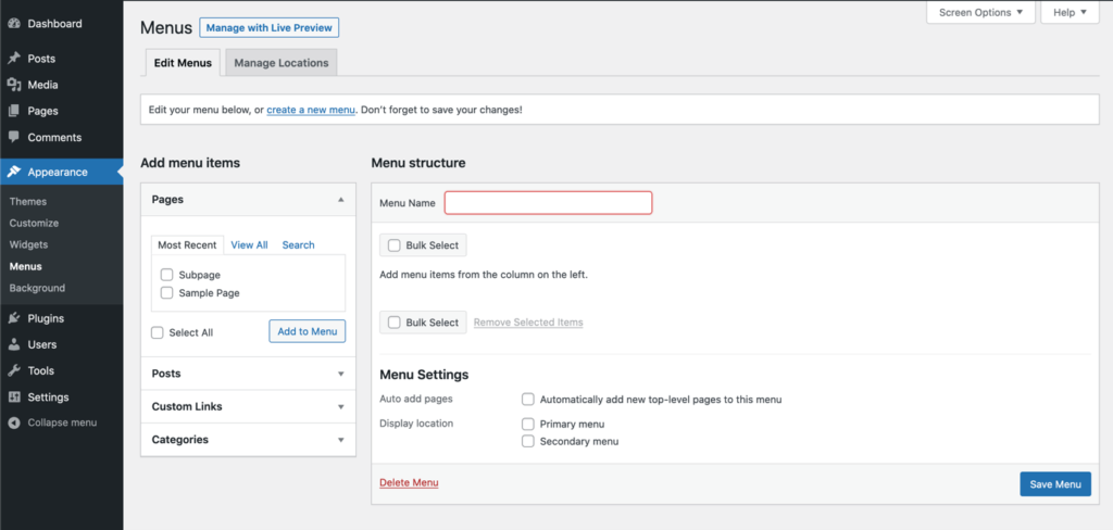
3. Creating and Managing Menus in WordPress
To build your first professional menu:
-
In the WordPress dashboard, go to Appearance → Menus.
-
Click Create a new menu, give it a clear name like “Main Header Menu”, and hit Create Menu.
-
On the left, select Pages, Posts, Custom Links, or Categories and click Add to Menu for every item you want.
-
Drag and drop items to reorder them. Move an item slightly to the right to create a nested sub‑menu under the item above it.
-
In the Menu Settings section, assign the menu to a location such as Primary, Header, or Main Navigation (the names depend on your theme).
-
Save the menu, then preview the site on desktop and mobile.
Use short, meaningful labels like “Pricing” instead of “Our Pricing Structure and Plans” to keep menus clean and readable.
4. Mega Menus and Advanced Navigation (Using Page Builders)
Some themes and page builders, such as Elementor Pro, Kadence, or Block‑based themes, support mega menus—wide dropdown panels that can show columns, icons, and even images.
If your course or NGO site has many categories, mega menus help:
-
Group content into logical columns (e.g., “Beginner Courses”, “Advanced Courses”, “Free Resources”).
-
Highlight specific items with labels like “New” or “Popular”.
-
Display icons or small thumbnails to make navigation more visual.
Typically, you enable mega menus in the theme options or the builder’s header template, then design the inside of the mega panel using the page builder blocks. Use them sparingly; the goal is clarity, not decoration.
5. SEO and UX Best Practices for Menus
Your menu is one of the strongest internal linking structures on the entire site. Optimizing it properly helps both users and search engines.
Follow these best practices:
-
Link only to your most important pages; remove low‑value or duplicate items.
-
Use human‑friendly, keyword‑aware labels (for example, “WordPress Course” instead of a generic “Learn More”).
-
Maintain the same primary menu on all main pages to build familiarity.
-
Ensure menus are fully responsive and easy to tap on mobile; small, crowded links lead to high bounce rates.
-
Avoid linking to pages under construction or thin content; they dilute link equity and trust.
Combine this with your on‑page SEO work and you’ll give search engines a very clear map of what matters on your website.
6. Introduction to Widgets and Widget Areas
Widget areas depend on your theme but commonly include:
-
Blog sidebar
-
Footer columns (Footer 1, Footer 2, Footer 3…)
-
Header top bar
-
Below post content or above footer areas
To manage widgets:
-
Go to Appearance → Widgets.
-
On the left, you’ll see available widgets (Search, Recent Posts, Categories, Text, Custom HTML, etc.).
-
Drag a widget into a widget area on the right, such as “Sidebar” or “Footer Column 1”.
-
Configure its settings and click Save.
Widgets let you enhance every page with smart elements: search fields, lists of popular articles, call‑to‑action buttons, or contact information.
7. Strategic Sidebar Layouts That Keep Users On‑Site
A chaotic sidebar stuffed with everything from archives to calendars does more harm than good. Instead, build a focused sidebar whose only goal is to keep visitors engaged and moving deeper.
For a blog or course site, a high‑performing sidebar might include:
-
Search widget at the top for instant navigation.
-
Primary call‑to‑action widget (e.g., “Join the Free WordPress Course” with a button).
-
Popular or Featured Posts widget to surface your best content.
-
Email opt‑in widget to grow your list.
Avoid unnecessary clutter like monthly archive lists and tag clouds unless they genuinely help navigation. Every pixel of the sidebar should serve a clear purpose.
8. Optimizing Footers with Widgets
The footer is often the most under‑used part of a website. In reality, many users scroll to the bottom to find trust signals and quick links. A strong footer can improve credibility and conversions.
Use your footer widget areas to add:
-
Mini navigation menus (About, Contact, Privacy Policy, Terms).
-
Contact information and location (especially for local businesses or NGOs).
-
Social media icons and newsletter sign‑up.
-
Short description of your organization or course with a link to the main “About” page.
Keep the design simple and consistent. Footers should help users, not compete visually with the main content.
9. Dynamic Widgets: Showing the Right Content in the Right Place
Some themes and plugins allow conditional widgets, meaning you can show specific widgets only on specific types of pages. For example:
-
Show a “Download Course Syllabus” widget only on course pages.
-
Show “Book a Discovery Call” only on service pages.
-
Show “Latest from the Blog” only on your blog sidebar.
If your theme doesn’t support conditional logic by default, you can install a lightweight plugin that adds “Display on these pages” rules. This makes your site feel targeted and intentional, instead of generic.
10. Accessibility and Mobile Experience for Menus & Widgets
Accessibility is not only a legal and ethical issue; it also impacts SEO. Search engines favor sites that are easy to navigate for all users.
Focus on:
-
Clear contrast between menu text and background.
-
Sufficient spacing between menu items, especially on mobile.
-
Descriptive link text (avoid “Click here” in navigation).
-
Keyboard‑friendly menus for users who can’t use a mouse.
For widgets, ensure that content reads logically when the page is linearized (for screen readers) and that important widgets appear early in the markup, not buried beneath decorative elements.
11. Performance Considerations: Don’t Overload Your Layout
Each menu item and widget adds complexity. Too many elements can create visual noise, slow down rendering, and distract the reader from your main goal.
Good rules of thumb:
-
No more than seven top‑level menu items.
-
One main sidebar layout for the blog; don’t redesign it on every post.
-
Keep footers to three or four clearly defined columns.
-
Skip heavy widget plugins that load large scripts or external iframes unless they’re absolutely necessary.
Pair lean navigation with caching and image optimization and your UX will feel fast and polished.
12. Practical Workflow: From Blank Theme to Professional Layout
Here is a simple workflow you can follow on any new WordPress site:
-
Create core pages: Home, About, Services/Courses, Blog, Contact, Privacy Policy.
-
Build the main menu: Add these pages, reorder them, create dropdowns for services or categories.
-
Create a secondary footer menu: Only legal and utility pages.
-
Design your sidebar: Add search, call‑to‑action, and popular posts; remove everything that doesn’t help your goals.
-
Configure footer widgets: Add mini navigation, contact info, and newsletter sign‑up.
-
Test on mobile: Make sure the hamburger menu and sidebars are readable and tappable.
-
Adjust based on analytics: Use scroll and click maps later to see how people truly use your navigation and tweak accordingly.
By following this process, you turn a generic theme into a navigation system tailored to your content and audience.
13. SEO Checklist for Menus and Widgets (Rank Math Ready)
Use this quick checklist each time you build or audit navigation:
-
The Focus Keyword “WordPress menus and widgets” appears in the title, introduction, and at least a few subheadings.
-
Internal links from menus point to your most important money pages and cornerstone content.
-
Menu labels are short, descriptive, and include natural keyword variations where appropriate.
-
Sidebars and footers contain at least one clear call‑to‑action.
-
Widgets are relevant to the content of the page and not duplicated excessively.
Activate Rank Math’s internal link suggestions over time to connect menu‑linked pages with deeper articles, reinforcing your site structure.
